

Where to Find Hidden Gems: The Best Places to Source Vintage Homewares
HOW IT ALL STARTED
My love for second-hand and vintage pieces probably dates back to the late 70s, when my dad thought the best source of weekend child entertainment was to take me to a place called Dens Road Market in Dundee on a Saturday morning. The promise of fizzy pop and a packet of crisps was enticement enough, and I didn’t need much more persuasion than this. These were simpler times I guess. Here you could find all manner of used furniture, clothes and cast offs. My dad, a true salesman, loved a bargain and instilled in me that you really shouldn’t ever pay full price for anything if you could avoid it. He once asked the cashier in B&Q, much to my mortification, “discount for cash?” What started out as an ad hoc trip to purchase some screws and used wood for another DIY project became a lifelong thing, the memories of which I hold on to pretty tightly. There weren’t many Saturdays missed, and under my dad’s tutelage I more often than not arrived home with a treasure trove of someone else’s trash.

Prints and candle sticks available to purchase on the website.
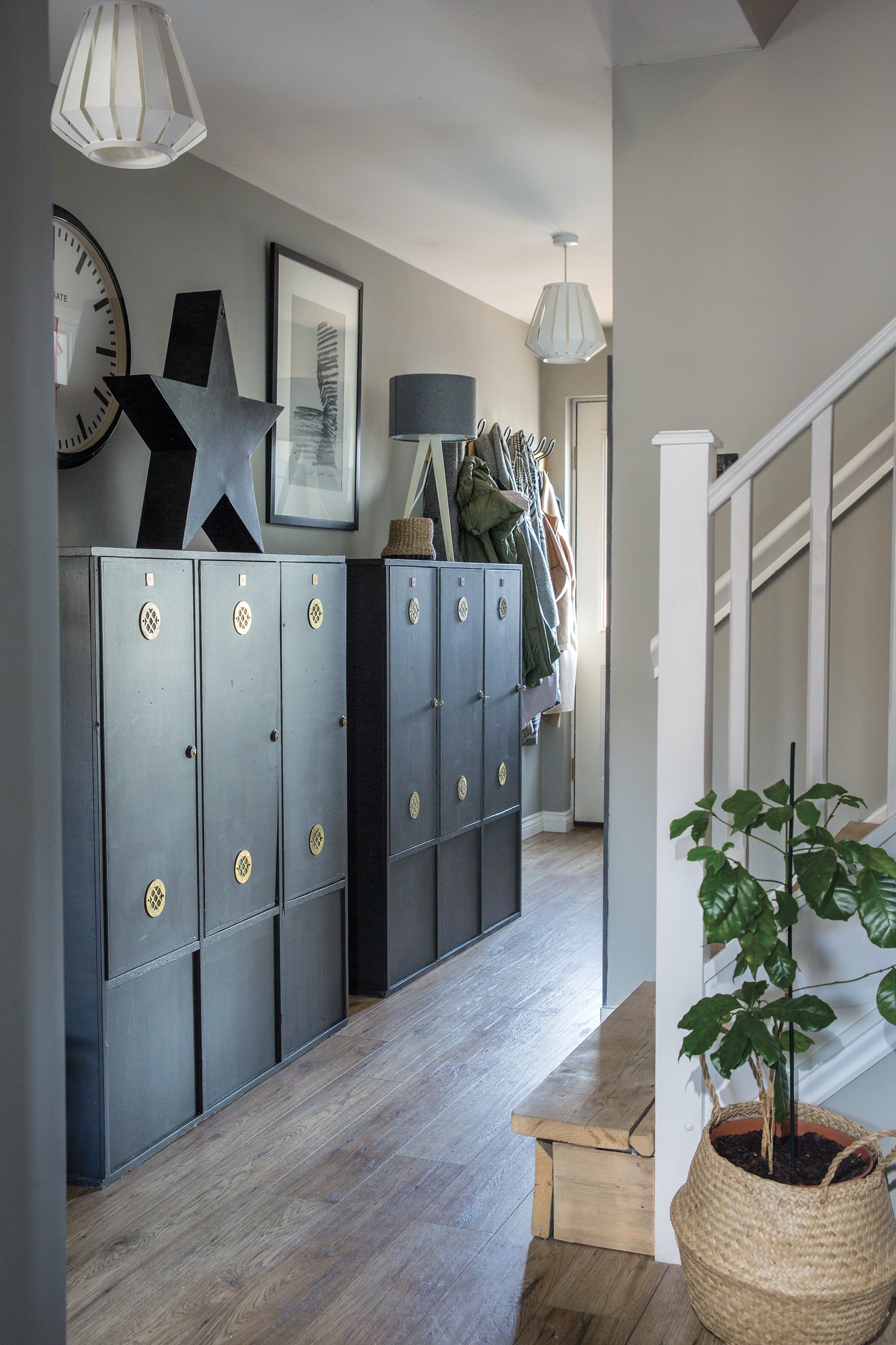
Fast forward twenty years and I’m still a hunter gatherer, found more often than not trawling a car boot sale, standing inconspicuously at an auction or browsing the occasional charity shop. For me it’s the chase of finding something vintage or reclaimed that I know instantly will work in an interior. Integrating them seamlessly into a modern or new environment requires patience, a good eye and in my experience a bit of luck. It’s another form of art, ok not the fine type 😂 but it takes skill to see how a piece lying at a car boot might work in another environment. It’s a bit of a balancing act between nostalgia and relevance. When done well, vintage and used don’t just fit in, they serve to elevate the entire space, making it feel richer, more layered, and more interesting.


Where to Source
So you’ve established that you love a bit of second hand style, but where do you start in your search? Sadly and hugely dissappointing for me is that the Dens Road market of days gone by is no longer a thing, but there are still plenty of places where with the right approach you’ll be able to pick up things that are unique and sometimes quirky in style.

Charity Shops & Thrift Stores
Whilst I don’t think charity and thrift shops should be ruled out completely, I am finding that they are becoming increasingly expensive, and many are run like a business enterprise rather than a way of raising funds for worthy causes. Only yesterday I saw a Tunisian ceramic lantern that was indeed very lovely, but the £30 marked on it made me think twice. I think there are a few reasons for the heftier price tags—most importantly the rising operational costs involved—but thrifting is trending in a way we haven’t seen, driven by sustainability and the budget-conscious among us. I’ve noticed too that with influencers promoting "thrift hauls," more people are jumping on the second-hand train. Don’t be disheartened, however, as many charity shops still offer better value than new retail, especially for unique, well-made, or vintage items. The key is knowing where to look, what days to go, and how to spot genuine quality over inflated trends.

Chair picked up from a recycling centre

Original oil paintings sourced from a car boot sale

Napkin rings
Auctions In Person/Online
I’ve been to a few auctions in my time. I’m not sure whether it’s the thrill of trying to outbid others in the room or the entertainment value from the sheer diversity of the people that attend these events, but either way, if you fancy a night out that involves a unique shopping experience with a few bits of laughter thrown in, then you should give it a go. Most in-person auctions offer you the chance to visit beforehand and see what they are selling on the night, so if you can, I would definitely recommend that you gain advance knowledge. Many auctioneers throw things together into boxes, which they sell as a job lot, so it’s a good idea to see first-hand what they contain. Many go for less than a fiver and often have a hidden gem or two. The most magical thing about an auction is that you may be the only person in the room interested in something, which ultimately means you’ll walk away with a bargain. Consistency, I find, is key, so try and attend a couple of these a month. You’ll start to learn the events that are geared to what you are trying to source.
Whilst the excitement of an online auction is somewhat diluted, it’s always worth considering—especially when during the winter an actual visit to a saleroom, from my experience, is like a polar expedition.

Restored Captain’s Chest

Portuguese Water Pitcher
Car Boot Sales
I have to say this is top of my list when it comes to sourcing gems that are affordable and unique. Nothing compares to an early morning car boot, where the air is filled with a mix of noisy chatter and the hint of an early breakfast. If you don’t like dogs or the smell of chips and curry sauce, then it’s probably not the place for you. However, you can literally source most things—think wooden camels from India, vintage brass elephant claw bells, and the odd ecclesiastical statue. I’m long-practised at car boots and head straight to the genuine ‘booters’ who are more often than not there to clear their houses for an impending move, downsizing, or just clearing out the accumulated tat from years of holding on to the unnecessary. Usually, you can haggle too—not for everyone—but people are there to offload what they can, so are amenable to reasonable offers. You also find people are excited to tell you the backstory to what they might be selling, so set yourself up for a wee history lesson too.

Facebook Marketplace / Gumtree / Online sites
I’ve always found Facebook Marketplace and other online selling platforms a good way to source specific things at reasonable prices. Although the price point is usually set by the seller, you can almost always haggle a bit. The added bonus of being able to set a radius for where you’d buy from means you can source stuff that is reasonably local to you. Let’s face it—a £50 table is hardly a bargain if it costs £75 for delivery. You’ll also find that there are Facebook groups selling in your particular area that are worth a look.

Flea Markets
Whilst these types of markets are not so common in the UK, on the continent they are a rich source of second-hand and antiquities, usually well-priced and well-designed. Flea markets are packed with one-of-a-kind pieces—from vintage ceramics to antique mirrors, old signage, and mid-century furniture. You’ll find items with soul, patina, and stories, which mass-produced décor just can’t match.
Most importantly, flea markets are fun! There's a sense of serendipity and excitement in finding a gem in a dusty corner or under a pile of odds and ends. That spontaneous discovery is all part of the magic.

This piece was handmade from various recycled pieces, including a pallet, drill handles, and old cabinet

For more information, visit our Furniture Showroom
Sourcing second-hand and vintage homewares isn’t just about finding a bargain—it’s about uncovering pieces with soul, history, and craftsmanship that modern retail often lacks. For me, that all began back in the 70s, thanks to my dad who loved the chase and haggle and taught me that there were far better things than mass-produced consumerism. Whether you’re scouring local charity shops, browsing curated vintage boutiques, or trying to take in the oddities and entertainment of a car boot sale, each find adds a new layer to your curated home. The thrill of the hunt, the sustainability factor, and the chance to create a truly personal space make vintage sourcing more than just shopping—it’s storytelling through objects. So take your time, trust your instincts, and enjoy the journey of collecting pieces that reflect not just your style, but who you are.

Greening your Workspace: How to create an inspiring outdoor office in your garden.
Without doubt, the last few years have seen a lot of us have a whole new appreciation for where and how we work. An enforced lock down and being told that we had to stay indoors saw many of us having to set up our desks at home, working from spare rooms, kitchens, cupboards and even the garden shed. Whilst many of us loved that we could start the day in our pyjamas, with a veritable river of tea flowing throughout the day, many of us missed the human contact and the connection we have by heading out to work.

Finding space for an office at home
What lock down did make many of us realise is that work doesn’t have to be about commuting every single day and that there are possibilities for a more hybrid approach. According to the Chartered Institute of Personnel and Development, employees started to report huge benefits to working hybridly, including a better work-life balance, greater ability to focus and fewer distractions, not to mention the time saved on travelling.

Taking the office outdoors
As a creative, I have always worked out of my home. My office has always been a bit of a temporal affair, more often than not stationed at the kitchen table until dinner time, the occasional hour or two grabbed in the lounge when no one was arguing over the tv, and if going all out a visit to a corner of Costas, contemplating my to do list. For a whole load of reasons, I happened to quite like this arrangement, not least that it gave me the flexibility to catch up on some smaller chores and of course allow a quick fix of the lunchtime news. However, as many of you will know, time does create an accumulation of things and the house was beginning to resemble a workshop rather than feel anything like a home. When you start to open cupboards that were assigned for pots and pans to find half used cans of paint, twigs for styling, and packets of airdrying clay, you know it’s probably time to rethink where you work from.

Office haven
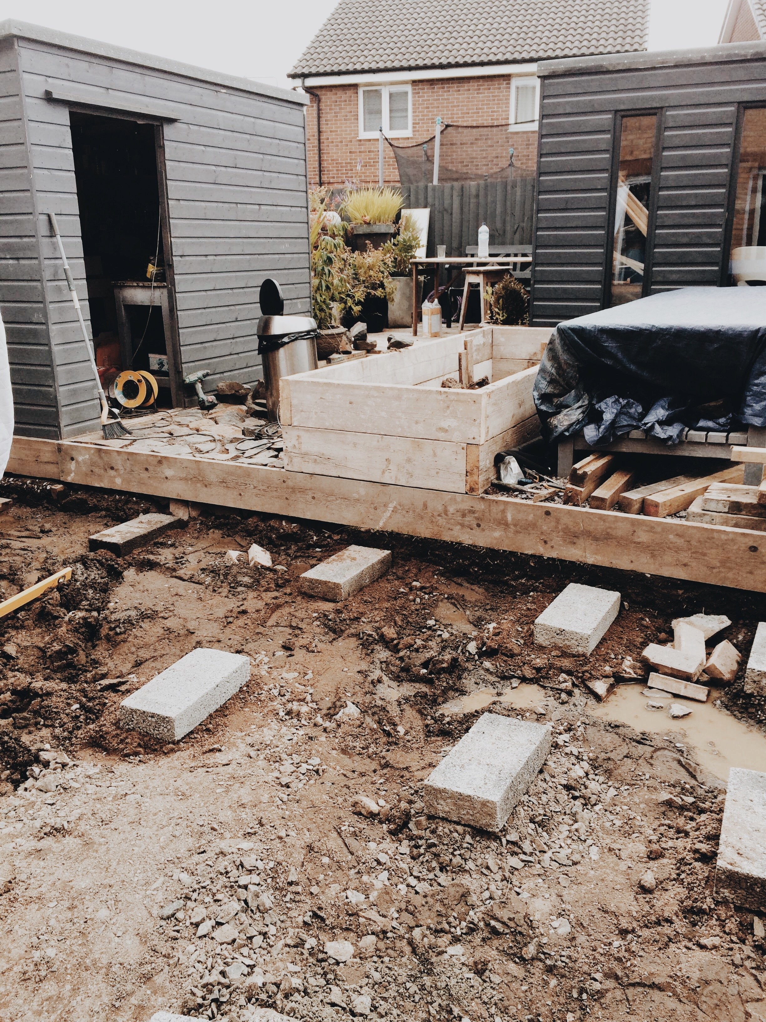
It had been in our sights for a while to make over the garden. As with most new builds, this area always seems to play the poor relation in terms of the developer’s scheme of ideas and with a patch of grass and some sorry looking leylandii trees, ours was no exception. With my workspace over-spilling into every corner of the house, it was time for a move. I’m very fortunate that in our house my husband is a bit of a dab hand at space planning, so within days of us deciding on the reboot, he’d drawn out a complete plan of how he imagined the garden to be, complete with garden office, raised beds, scaffold boards and an elevated deck.

Before: Summer house in progress

Before: laying out the parameters

Before: Foundations for the scaffold deck
Taking care of grass can become a bit of a full time job if you let it. Who knew you have to become adept in scarifying, fertilising, and feeding it in order for it to be ranking in the top ten golfing greens in the land (husband’s goal setting not mine). We had decided from the outset that we would keep the garden as low maintenance as possible, so although digging up the grass was controversial and put paid to any ideas for a putting practice area, in the long term it meant that as well as removing the constant need to cut it during the longer summer months, we would prevent the mud myre it might become during winter. Our plan was to create two raised beds for planting. We had brought cuttings from our previous house in pots to mix up with new ones we’d bought from the garden centre. I always think is a lovely thing to do if you can, as plants can offer nostalgia and memories and for me it’s comforting to look out remembering where they came from.
Elevated deck

Raised beds using scaffold boards
Second up was setting the foundations for the summerhouse. We hadn’t ever planned a large garden makeover before, so to all you pro builders and landscape gardeners out there, apologies if this isn’t the way you would do it, however it seemed logical to use this as our starting point, thereafter laying the deck and the raised beds. Once the foundations of the garden room were constructed, we built up tongue and groove on each side using pine from the local joiners yard, finishing of with an angled bitumen roof. I wanted to paint the whole thing black, however certain family members were resisitant to this idea, so we compromised with dark grey (well that’s what it said on the tin).

Sunmmer house nearing completion
As we were going to be using this primarily as a workshop/office, proper insulation was crucial to the whole design. If you havent heard of it, Kingspan is an excellent choice for lining walls, it’s a clean application compared to its fibrous counterparts and is easy to fit too. I had always had a vision for a shiplap finish inside, which we achieved by using sheets of MDF and then adding extra lengths on top. Admittedly a lot of layers, however it served to further enhance the insulation. We finished off with a full height double glazed door, picture window (great for looking out on to the garden) and two narrower galley windows allowing lots of light into the space. We didn’t tackle any of the electrics ourselves, leaving this to our expert neighbour Paul, who knows a thing or two about sockets and circuitry. In our drawings we’d made provision for four sets of double sockets and six down lighters in the ceiling. This way we could have task lighting, and all the essential electrics and wi-fi for a hard working office.

Interior in progress
I am a consumate upcycler and I love the current trend to use scaffold boards for decking. Not only do they look substantial when they are laid, they are also cheap, easy to lay, low maintenance and pretty easy to source. Always remember to treat them with a wood preserver before you lay them, (a lesson learned) as although scaffold boards are essentially designed for the outdoors, the harsh winters here, especially in the north east of Scotland do take their toll.

Using scaffold boards as an alternative to decking.
At the point where it was time to consider flooring and paint, our budget had been seriously hit with lots of unexpected extras, not least the increasingly exorbitant costs of wood and my weakness for a garden centre. In my utopian world I would have loved to have laid hardwood flooring, but on hindsight laminate was an excellent choice, as it’s so much more resistant to scratches and general wear from the daily footfall. I absolutely love nordic design, so from the outset I wanted the interior to have a Scandinavian feel, and charcoal tones were right up there in my design. Usually darker colours can draw a room in and make it feel smaller, however our final decisions on where to position the door and windows meant that there was an endless amount of light, and therefore opportunity to use more dramatic colours. The overall scheme worked well, making the room feel spacious in the summer and cosy in the winter.

Laminate flooring, a good choice if you don’t like seeing scratches and marks
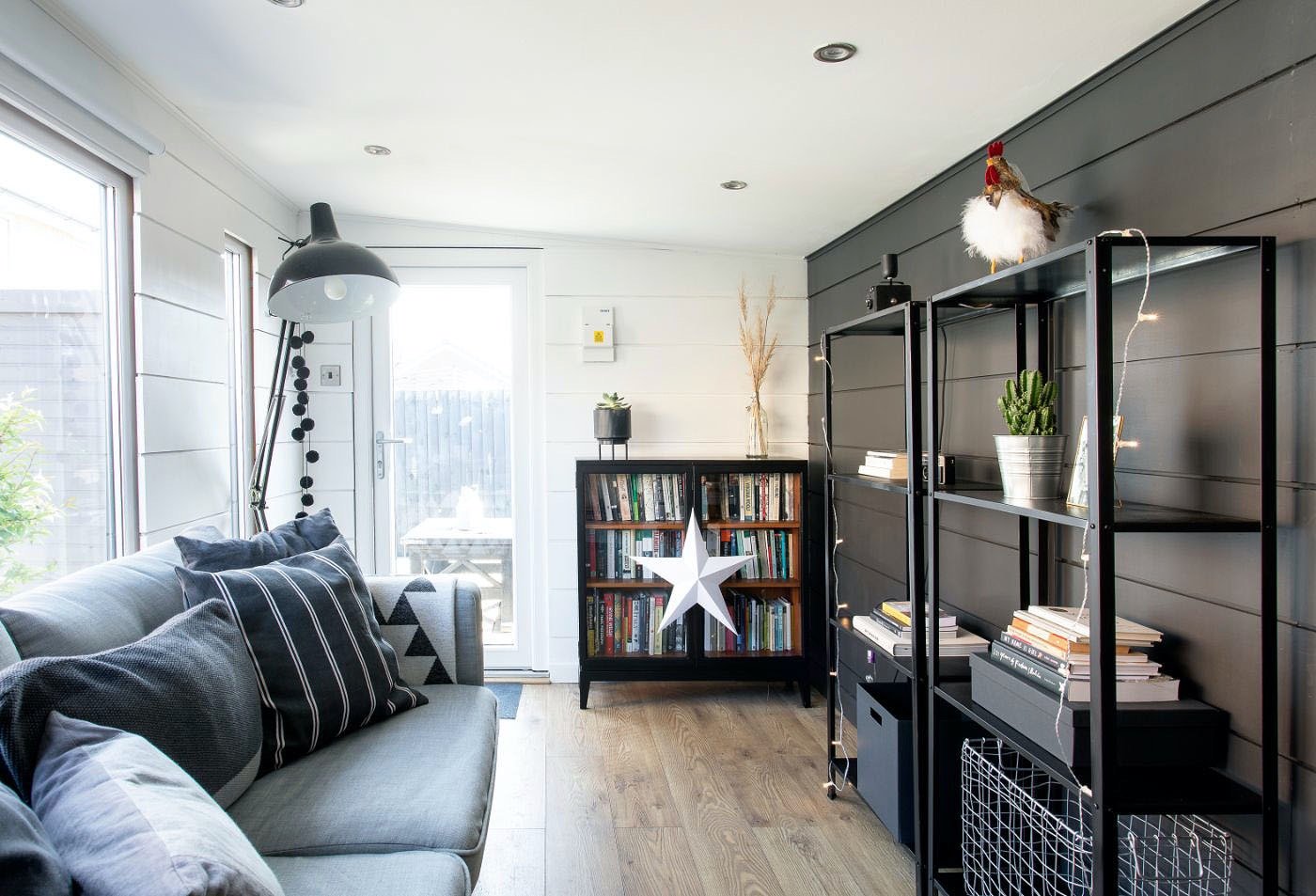
Double glazing and shiplap create a fully insulated space, warding off the tough Scottish winters
A quick trip to Ikea for some office essentials, (no Billy bookcase was purchased in the making of this) an upcycled sideboard from my local second hand shop and some new stationary (of course) saw the project completed.

Six weeks in the making
Looking back, it did feel like the project had evolved organically, although my strategic thinking husband may well disagree. I have to admit I was a little nervous about such radical changes and the upheaval involved, but after lots of days grafting, mainly by my husband, ( I tend to be clerk of works and tea maker on these projects) the transformation was completed in around six weeks.
I think being fortunate enough to have this separate space allowed me to set clearer boundaries between my work and home life, and although my commute was short, it did seem like I was heading out to work each day. Strangely too, there seemed to be less noise about the confused cupboard situation going on in the house.
Was it worth all the hard work and effort? Absolutely.
So why build an outdoor garden office?
Improved Work-Life Balance: Having a garden office certainly allows you to remove yourself from the home environment, creating clear boundaries in terms of your working hours and helps to reduce the likelihood of work-related stress spilling over into your personal life.
Reduced Commuting Time and Costs: There’s no longer a need to face the daily commute to a separate workplace, saving both time and money. We probably spend at least an extra couple of hours doing this, so having your workplace in the garden can lead to increased productivity and a better quality of life, as well as a reduction in carbon emissions associated with commuting.
Increased Productivity: The peaceful and quiet environment of a garden office can lead to increased productivity and concentration. With fewer distractions compared to a traditional office or working from home, you may find it easier to focus on tasks and complete them more efficiently.
Customisation and Personalisation: Garden offices can be customised to suit your specific working needs and preferences. You can design the space to reflect your personal style and have some fun in the process creating a comfortable and inspiring environment that promotes creativity and productivity.
Connection with Nature: Working in a garden office allows you to enjoy the benefits of being close to nature. Natural light, fresh air, and the calming presence of greenery can contribute to a more positive and healthier working environment, leading to increased well-being and reduced stress levels.
Privacy and Distraction-Free Environment: A garden office provides a secluded and quiet space away from the main household activities, reducing interruptions and distractions.
Versatility: A garden office can serve multiple purposes, such as a dedicated workspace, a creative studio, a home gym, or a relaxation area. Its versatility allows you to adapt the space to meet your changing needs over time.
Property Value: Adding a well-designed and functional garden office can increase the overall value of your property. It can be an attractive feature for potential buyers, especially in a post-pandemic world where remote work is becoming more common.

Verdant Vibes: The recent rise of green in modern interior design

Image: seanandersondesign.com
I’ve noticed lately that the greige palette traditionally offered by our Scandinavian friends is having a little overhaul. If like me you love the whole Nordic design movement, you’ll know that whilst there has always been appreciation for brighter colours, largely these design schemes are recognised for their more muted, neutral tones, bringing a sense of calm and serenity to our interiors. I’m not entirely sure where my fondness for Scandinavian design originates from, but my love for natural materials and a sheepskin and my unrelenting need to watch all Viking programmes, fact or fiction, would suggest I might have been a Norseman in my previous life, albeit not one of the pillaging variety (I hope).

Our grey kitchen Image: Julia Caira
A few years ago our interiors slowly started moving away from the greys that had dominated for so long, instead we started to embrace more grounding colours. According to many interior designers, grey was officially shown the backdoor in 2023. Honestly, this was slightly disappointing to hear, as not only is my house many shades, I happen to love grey, from the palest to the darkest tone. I always think you can’t go too off piste using it either, as it provides the perfect backdrop for layering up and usually sets off any colour scheme.


Post pandemic after spending most of our time stuck within the same four walls, talking to the same people day in day out, we could be forgiven for feeling our lives had all become a bit beige-y. When our freedoms returned it seemed there was strong emphasis on bringing a bit of our outdoors in. It seems too that as a result of an enforced lock-in there has been something of a paradigm shift, a softening of the edges and a conciliatory nod to nature in many of our monochrome designs.

Using our natural surroundings as inspo for this bedroom design by cocolapinedesign
There are noticeably many shades of green (including gray-green for all you grey devotees) weaving their way back in to our interior schemes and when we inject it, we create tranquility, balance and growth. Many of us are now choosing to move away from a strict monochrome palette with the main aim of injecting some personality and character into our homes. The use of natural elements such as greenery and earthy tones isn’t a new thing and has always played its part in what’s referred to as biophillic design, a fancy word for seeking to connect spaces with nature. More now than ever before are we embracing this, reminding ourselves the importance of feeling connected with what surrounds us.

Gray- green is having a moment paired with black and white for a sophisticated look
Image : Kate Guiness Design/ Francesca’s paints/ Gunter&co.
“Grey green is having a moment, a warmer colour than the greys we’ve been using over the last decade, it’s the perfect middle ground. ”


Sales of green fabrics and wallpapers have seen an upsurge in recent months and seem to be taking over from their grey and white counterparts and we are seeing more and more kitchen designers favouring green as an alternative cabinet colour. We cannot deny green is incredibly perennial and has seen off it’s competitors time and again, creating an air of longevity in the home. Green is versatile in interior design and it’s ability to complement and enhance other colours, means it remains a popular choice for walls, furniture, and accessories. With so much talk lately too around sustainability, green is also associated with environmental consciousness, reflecting the growing emphasis to look after our planet and use more eco friendly materials.

Dark tones create a dramatic backdrop for pale scandi furniture
Image: Neptune Paints Constable
With so many shades of green out there, a visit to B&Q’s paint mixing department can leave you feeling a little overwhelmed. I don’t know how many times I have gone in there, colour swatch firmly in hand and left with a completely different shade from the one I intended, helped along by the friendly paint mixing person, who always seems to have an opinion. If you are painting with green for the first time I would suggest on your first visit you leave only with tester pots. I say this with some authority and experience, as I once made the mistake of purchasing a 2.5 litre tin of grey paint without testing it, only to realise it was the wrong shade after it spilled all down the driveway.

Using sage green on kitchen cabinets is slowly replacing grey
Image: Rebecca Wakefield Treron by Farrow and Ball
With such versatility, green can work really well in any room of the house, so long as you remember to tailor the shade to the space. I tend to find that softer greens like olive or sage work well in spaces where you wish to reflect a sense of calm and serenity, whilst brighter, more vibrant greens such as forest green or jade are a perfect fit if you wish to exude energy and some vitality. If like me you don’t seek overstimulation with colour, you may find painting all the walls green a step too far, but that doesn’t mean you can’t introduce it in smaller ways through upholstery and accessories like cushions, throws and lamps. Adding a bit of green here and there to each room, will create continuity, calmness and connection throughout your home. Whilst we may never see the return of the advocado bathroom suite, the timelessness of green means it will remain a classic choice for many of us for years to come.
“A room should never allow the eye to settle in one place. it should smile at you and create fantasy. ”

Mixing dark wooden furniture with forest greens connects us to nature and our surroundings.
Image: The Anvil Hotel
Stòf Living is featured in a Rent. article
Read the full article here:
Pistachio Green is Taking Over Interiors and Here’s Why | Rent. is a subsidiary of Redfin.com
Cushions: The unsung heroes of home comfort.

Whether we like to admit to it or not, I think we all have one small addiction or another. For me, I have to confess there are a few, cushions, chairs, and Christmas decorations (in no particular order) and possibly Kevin Macleod, although I’d rather say I have great admiration for him, so I don’t come over sounding all stalkerish. I’m forever telling handy husband how lucky he is that there aren’t more on my list, but his eye rolling gives me the feeling he’s not totally convinced. A quick scan of the bottom part of my wardrobe might evidence there’s also a thing for shoes going on.

Today, let’s talk cushions, pivotal in many room schemes and from my own experience quite often the starting point for many a change in style and colour choice. Strangely they always find a way into our home unnoticed, multiplying until there are more cushions than sofa. Were it not for me, I don’t believe anyone in our house would see a remote need for these crowd pleasers. These soft and versatile accessories are not only just pieces of fabric filled with padding, but are the silent companions that enhance style, comfort, and ambience in our homes, not least forgetting they promote good posture and well-being, reducing physical strain and generally making us happy.

Using monochrome to achieve a Scandinavian style
Beyond their ergonomic value, I think cushions offer up a certain amount of nostalgia. We associate them with cozy winter afternoons on the sofa, shields for scary movie nights, an afternoon’s target practice with the kids, or simply finding comfort in their embrace.

Making a hard wood seat comfy with cushions
Cushions can also be a canvas for our creativity. With so many options out there, a vast array of shapes, designs and patterns, they allow us to express our personality and decorate according to our tastes. Whether you like maximalist chintz, Scandinavian minimalism or Bohemian restfulness, cushions can be used to tie together a theme or make a bold statement.

Injecting autumnal colours into your scheme
You can buy cushions with an exisitng insert or as a single cover. If there is one thing I’ve learned over the years it’s that the insert is everything and your choice can make or break the finished look. One of my pet hates are synthetic polyester versions, cheaper than their feather counterparts, they more often than not result in your cushions taking on a wearisome and “seen better days” appearance. Although a little more expensive, I much prefer feather fillers, a sound investment, not only are they better in terms of their longevitiy (a quick plump up makes them as good as new) they are also much more comfortable, and tend to sit better on your sofa. Also remember to size up on your insert by at least 1cm all round, so the cushion cover is well filled.

Feather inserts create a plump cushion
Choosing cushions to sit together can be an art in itself. When deciding, here are a few things to keep in mind.
Colour co-ordination - It’s important to think about what will compliment the colour of your sofa and the room. Depending on your style you can either match with different textures or contrast with different colours.
Size matters - Mixing different sizes can create a dynamic look, use larger cushions at the back for support and smaller ones at the front for comfort.
Texture - Incorporating different textures can add depth to your scheme, think velvet, linen and weave for a tactile contrast.
Pattern play - If your sofa is plain, introduce patterned cushions or vice versa.
Odd numbers - Odd numbers of cushions tend to look more aesthetically pleasing than even numbers.
Comfort v’s decor - It is important to strike a balance between decorative cushions and those that provide comfort.
Personal style - Let your personal style shine through your choice of cushions, mix and match to create a unique look that represents you.
Seasonal swaps - Consider changing your cushions with the seasons, using lighter, brighter colours for spring and summer and richer, deeper colours for autumn and winter.
Consider your sofa style - The style of your sofa plays a part, if you have a modern sofa you might chose geometrics, if it’s more tradtional in style, it may suit more muted classic colours.
Quality Matters - Invest in good quality cushions and inserts to maintain shape and support.
Proportions - Ensure that the cushions you chose are in proportion to the size of your sofa. A tiny cushion on a small sofa will look lost.
Try before you buy - If possible test out your cushions on your sofa or bed.

With the changing season upon us, we are being offered up new designs, think autumn leaves, tonal neutrals with a pop of colour here and there. Here is a round-up of some of the lovely offerings out there.

Beautiful woven texture in this pink/navy cushion
Click on the button

Stripes give a nautical touch

Scandinavian style from House Doctor

Pops of colour fade grid cushion
Pink & Gold Abstract

Autumnal colours of Totemic Cushion
Transforming Treasures: The art of sourcing and painting second-hand furniture
It’s hard to pinpoint exactly when painting furniture became fashionable, but my rather patchy google research would suggest from the mid 1600’s to the mid 1800’s paint was the humble medium of choice for pimping up your cabinetry. According to other somewhat limited annals of history, painting your drawers, of the wooden type, was not just a country or folk art phenomenon, but was also the pursuit of the middle and upper classes who saw it as a way of keeping up with the Jones’s by disguising otherwise inferior and sometimes unfashionable pieces.
We’ve come a long way since those days, up-cycling and painting furniture over the last few decades has increased in popularity and a furniture makeover is more of an afternoon’s work rather than weeks in the workshop. Paint can be transformative and with a little bit of imagination it’s amazing what you can do with minimal effort.

SOURCING THE RIGHT PIECE
As a lover of old furniture, I’ve always packed my rooms to full capacity, much to the consternation of the rest of my family, who truly don’t see much of a need for a dresser whose sole purpose is to play host to my vintage cutlery collection, hand thrown pots and ever increasing packets of paper napkins that I appear to have a slight addiction for. Some things they will never understand.
Sourcing good furniture for a project has become a little more tricky over the years, I’ve found. An awareness of environmental issues, the need to retreat from our throw away society, and the ever increasing cost of living, has seen lots of us choosing to shop in local charity shops, second hand recycling centres, auction houses, browsing Facebook Marketplace and eBay. Whilst this popularity is fantastic news, contributing to lessening the big carbon footprint we talk of, it means that the sale-rooms of old are diminishing in both numbers and stock. This doesn’t however mean there aren’t good pieces to be had out there, you just need to put in a little extra effort tracking them down.

BEFORE |Laura Ashley Portobello 10 drawer unit

VISUALISE
Whether it’s a piece you’ve already got at home or you’ve picked something up recently, it’s always a good idea to initially work out where it’s going and what it’s to be utilised for. If it’s to be in a high traffic area where it’s likely to play host to keys, bags and the odd sweetie wrapper, or it’s a new storage facility for Lego or Peppa Pig’s fan club, then a good hardy finish will be important, but if it’s something you intend to use for more grown-up purposes, such as display or to balance out the room, then your transformation process should be a little less onerous. The key to the work involved lies largely with your vision for it.
Look at Pinterest, Tiktok and Instagram for inspiration and remember to take a few quick snaps of your project before you begin, and if you’ve time, during the makeover, as it’s always great to see the transformative process. This Laura Ashley Portobello ten drawer unit, picked up on Facebook Marketplace was given a makeover using Farrow and Ball’s Eggshell in Downpipe.

PREPARATION
Preparation is key, so a very nice and helpful time served painter told me once, although I've never been one to do things methodically, preferring a quick fix, "Bob's your uncle" with most projects. Who doesn’t want to race on to the finish line and see the end result. Over the years however those words ring true and from experience I would always encourage you to start any project by giving the piece a good sand either manually or with an electric palm sander. Not only does this serve to clean off any debris but it also gives your paint an excellent surface to adhere to. Always make sure you either do this outside or in a well ventilated room and crucially to protect yourself, always wear a mask. If the surface to be removed is pretty stubborn you can begin with a rougher grade of 40 or 80 grit working up to a finer 120 grit, to finish off. If you’re planning to paint a block colour, it’s not imperative to remove all previous varnishes or paints, so long as you’ve roughed it up enough so that your primer can grab on. The other option of course is to use a paint stripper like Nitromors. I tend to shy away from these, but if the varnish or paint is very old and thick and the sander just isn’t cutting it you can use these sparingly to remove more stubborn parts. It’s also useful if you have intricate detailing in the form of moulding that has got lost to the layers of paint. As with eveything chemical based, make sure you do this preferably outside and don’t forget the mask and gloves. If you do have to use this then always follow with another light sand just to prep for the paint. I’ve also learned over the years to give the prepared surface a good cleaning over with a product called sugarsoap. This is great for removing any dirt or loose sawdust, ensuring that the paint will glide on.
Always make sure before you start you remove (if it’s possible) all the ironmongery, either setting aside to refit later or to replace. Handles or knobs can make or break a piece in my opinon, so spend some time thinking about how the exisiting ones will look with the paint choice.

BEFORE | Unit picked up at local recycling centre Furniture Plus.

Sanding down and prepping for primer.

TO PRIME OR NOT TO PRIME
Whilst it’s not always necessary to use a primer, I find that by doing so you definitely save on your final paint colour, as then one or two coats is usually more than adequate. As you apply it you’ll also get a good indicator of whether the surface of your furniture needs any more work, with the option to lightly sand off any additional imperfections the primer may highlight. You’ll find too that the finished paint job looks and feels smoother as a result. Don’t however be a slave to perfection, I find that as with any piece of old furniture, it’s patina, dents and flaws are a nod to it’s provenance and timelessness.
At your local store you’ll find an assortment on offer, but a simple primer for wood and metal is ideal. The good thing too is that you can buy white if you’re planning on painting with lighter colours or grey if you're going darker. The best I’ve used to date is by Zinsser, Bulls Eye 1-2-3 Plus, affordable and does exactly what it claims.

WHICH PAINT TO CHOOSE
With so many different paints on the market, a visit to B&Q can leave you feeling overwhelmed by so much choice. Although from experience there always seems to be a helpful person in the paint mixing department, ready to offer up their own opinion on colour. Heed their input or not, the good thing is that advances in paint technology mean that there is quite literally a paint for every surface, so the process of deciding on the correct one to use has become so much easier. Whether you’re going all out with a complete kitchen cabinet makeover or sprucing up your garden pots after a hard winter, you’ll find specific products for your project. Make sure when you’re choosing your paint that you consider the finish you want. Personally I like my projects to take on a duller appearance, so tend to go for a matt or dead flat finish, however using a satin wood or an eggshell will give a soft sheen as well as durability. I also tend to look for water based products as they are so much kinder on the environment and your brushes and cleaning is therefore easy.
Apologies in advance to all you chalk paint lovers out there, however I am not a fan, there I have said it. To be honest I’m well over the shabby chic look of the mid 80’s. I don’t doubt the quality and usefulness of this paint as when it first appeared on the shelves of DIY stores it was hailed as a quick-fix route to transforming your furniture, and yes Pinterest was bursting at the seams with pictures of before and afters, however my own experience using it has never been very successful. Overall I don’t find using it any less labour intensive than the route I’ve mentioned above. I find usually it’s very thick in the tin so you need to water it down quite significantly before application and this usually means many coats are needed. It’s recommended that you apply a layer of wax on top, but I find it never goes on evenly, leaving a half shiny, half dull finish. Whilst I’m sure it’s a case of practise makes perfect, it’s never going to be my paint of choice (cue chalk paint devotees riot).

TOOLS OF THE TRADE
I’m often asked about which rollers or brushes give the best finish. From experience I find that a mini gloss roller gives the best coverage. When you use this alongside a flat edged, small, natural fibre brush, you’ll get perfect ultra smooth loading and release of your paint, and resultingly a great patina.

FINISHING OFF
Remember that most paints can take up to three weeks to harden or “cure” in painters talk, so I would recommend that you refrain from placing anything on surfaces until they feel completely dry to the touch. Whilst the odd scratch over time is enevitable, you can also give added protection by finishing off with a layer of matt clear varnish. I’ve found that yacht varnish works really well and although a bit more on the expensive side, it gives good, long lasting coverage and a tin will see your through many projects.
HINTS & TIPS TO REMEMBER
Preparation is key, so always have a think about what you intend to use the piece for, that will help in the painting process.
Always sand, so that the paint has something to adhere to, and make sure there’s plenty ventilation. Wear a mask and gloves, safety first.
Use an undercoat and primer in one as your first coat. This will save time applying several coats of your chosen colour and make the finish more durable.
Always, always thoroughly mix your tin of paint before starting. If you don’t do this you’ll end up with a shiny surface (true story).
Your finish will always look professional if you apply paint with a mini gloss roller.
If the piece has ironmongery, think of ways to re-use what you have, it’s amazing what some spray paint can achieve. If the handles or knobs aren’t to your taste, look on sites like Ebay and Facebook Marketplace for alternatives.
Sit back and enjoy what you’ve achieved.

Panelling Your Pad|Part 1: How to use panelling throughout your home.

BEDROOM | JACOBEAN GRID STYLE
I’ve loved panelling forever, and have used it extensively in all the houses I’ve lived in. Wall panelling adds character, charm and personality to a property and has more recently become a standard constituent in the makeover of many households. In fact it’s probably safe to say the trend has gone stratospheric. It’s the absolute saving grace if you’ve wonky walls that any amount of plastering just won’t fix. It’s cheap to do, no remortgaging required and will have your friends “oo-ing and aw-ing” when they come to visit. It’s a trend that has seen thousands of homeowners reach for their hammer and nails, as it’s so effective and much easier to do than it looks. Over the years it has emerged in various forms, including period designs, tongue and groove, and traditional shaker-style, the choice is really pretty endless.
PHOTO CREDIT Eve Conroy
My very first venture into applying the panel was over 15 years ago, after swooning over an article in a copy of Elle Decoration where they had used wood to create ¾ length panels around a room. Back then the idea of panelling wasn’t so fashionable as it clearly is now, Farrow & Ball paint discussion forums were an idea for the future and my flip phone couldn’t even yield a photo let alone allow me to talk incessantly about the joys of a panelled wall. I decided our snug room was the perfect project to start with, it had sat for a number of years quietly serving us as a playroom come makeshift frube throwing area. This wasn’t exactly what I had envisioned for it, but children do have a habit of grounding you and making you realise life isn’t a game of perfect. It was a somewhat bold idea, flowery borders were king and most of our rooms in our semi-detached property had been subjected to the Laura Ashley chintzy makeovers of the early 90’s - patterned wallpaper, borders to match and some accompanying throw cushions. Yes, in spirit I was Audrey Forbes-Hamilton just without the manor. Not that I am knocking that whole design era, I bloody loved it (and my matching turtlenecks, come to think of it), however post babies I was craving a streamlined, serene and contemplative space devoid of wall scribbles and the ever present smell of strawberry yoghurt. It was time for it to grow up.

SNUG ROOM | SHAKER STYLE
In stepped local joiner Ryan and his handy other half. Within weeks, after extolling the many benefits of a planked wall, which if I’m honest may have fallen on deaf ears, our snug room was transformed from playroom to pretty cool. A coat of watered down PVA glue and two coats of string by Farrow and Ball made it feel contemporary and modern. Up came the beige-y carpet and down went a wide planked wooden floor. Wipeable panelling, our design ideas at last a reality.
PHOTO CREDIT Douglas Gibb Photography
We had certainly caught the panelling bug, as our next use of it came a few years later when we were renovating our kitchen. Our house at this point was a semi-detached Victorian townhouse, so built in the 1900’s when people were still lucky enough to have not quite Carter from Downton on duty, but a servant or two keeping the place in order. This was evidenced by the (thankfully) non functioning large wooden Butler’s Bell box and the uneven wall between the kitchen units and the dining area. At some point the previous owners had decided to knock through the two adjoining rooms to create one large open plan kitchen/dining space. A lovely idea in theory, but you will know if you’ve done any building work that such grand designs can have unwanted fall out.

KITCHEN | WALL TILES
Our problem was that the removal of the dividing wall had left the join from floor to ceiling bumpy and uneven and no amount of plastering was ever going to fix it, plus our budget was already significantly stretched with putting in a new kitchen. I’ve found from experience that you seriously need a bank loan to do any amount of plastering, it’s so expensive and leaves a mess everywhere. With very little money left in the pot, we began to look at other ways of hiding our wonky wall. There were various family suggestions, none of which were too helpful, moving house, hanging a heavily gilted picture of the Last Supper as a cover up, or affixing an extra shelf or two, however I was looking for something that was much more of a statement. I’d seen an idea using very large squares of MDF affixed to accompanying panels. Controversial, I know as MDF doesn’t get the best crit for reasons of safety, but it’s come a long way, and now if you search around, you’ll find companies that manufacture MDF in a much more environmentally conscious way. The job itself would become much bigger than I had anticipated. For starters the panels were akin to the biggest stone floor tiles around, so very heavy and large to attach to the wall. Kevin the very young carpenter wasn’t so impressed either as each tile required a 5cm spacer, not an easy job holding a spirit level, a heavy plank and a hammer whilst trying to get everything straight. Just to add to the challenges there was a range cooker to work round and a window. I’m sure there were a few expletives when I wasn’t within earshot, but persevere he did and within a few days I had an amazing grid style wall. It had always been in my head to paint it grey, so in effect it did take on that look of concrete tiles, however I happened to come across an article in an interiors magazine where Sophie Conran had used bright pink in her kitchen to compliment her black units and shelving. I was so blown away with the vitality of the space she’d created that I was in B&Q the very next morning looking at all the pinks on the mixing charts. The following afternoon,just like that, the walls were flamingo-ed.
PHOTO CREDIT Douglas Gibb Photography

BATHROOM
TRADITIONAL
TONGUE & GROOVE
Our last panelling project in this house was in our main bathroom, where we used traditional tongue and groove.I have to say that although it’s a pretty traditional look, it’s still one of my favourites as unlike some wall treatments out there, it always seems to remain current and gives you the flexibility to change up the colour scheme more frequently. I had pondered over tiling the room, it seemed the more practical option, what with two pre-teens who still believed bath time was an opportunity to flood the floor, rather than wash away their day, but the purchase of a free standing bath had knocked our ever decreasing budget to it’s knees. The ceilings in this room were high, so in order to create a cosier space and the illusion of a lowered ceiling I decided to take the panelling only half way up. Not only did this protect the walls from the nightly tidal wave and general wear and tear of family life, but additionally brought architectual shape and life to what would otherwise have been a pretty featureless room.
PHOTO CREDIT Douglas Gibb Photography
TIPS FOR WHEN YOU ARE PANELLING
I’ve found that you don’t always have to use nails to fix the batons on to the wall. If they are light then a strong wood glue will suffice and this also removes the need to hide nail heads and spend a whole morning filing holes and sanding back.
If you have a new build, the walls are more likely to be plumb, so you can save time and money by creating the design directly onto the wall, without the need to apply large sheets first and then your scheme.
Make sure to sand the edges of any panels/batons you are applying as it’s more awkward to do this once they are stuck up on the wall.
MDF is porous and therefore you should seal it before painting, otherwise you’ll spend a veritable fortune on paint. There are lots of priming and undercoat brands out there, however I find if you dilute PVA glue and apply it, this works just as well and is so much cheaper.
I always use a water based eggshell as my finish, applied with a mini roller and find that two coats work best.
I honestly could chat interiors incessantly, but for fear of sending you all off into involuntary sleep, I’m resisiting the urge to make this debut blog the interiors equivalent of War & Peace. Leaving you with some tips and advice to use if you do decide to join the panelling renaissance.
You’re welcome x